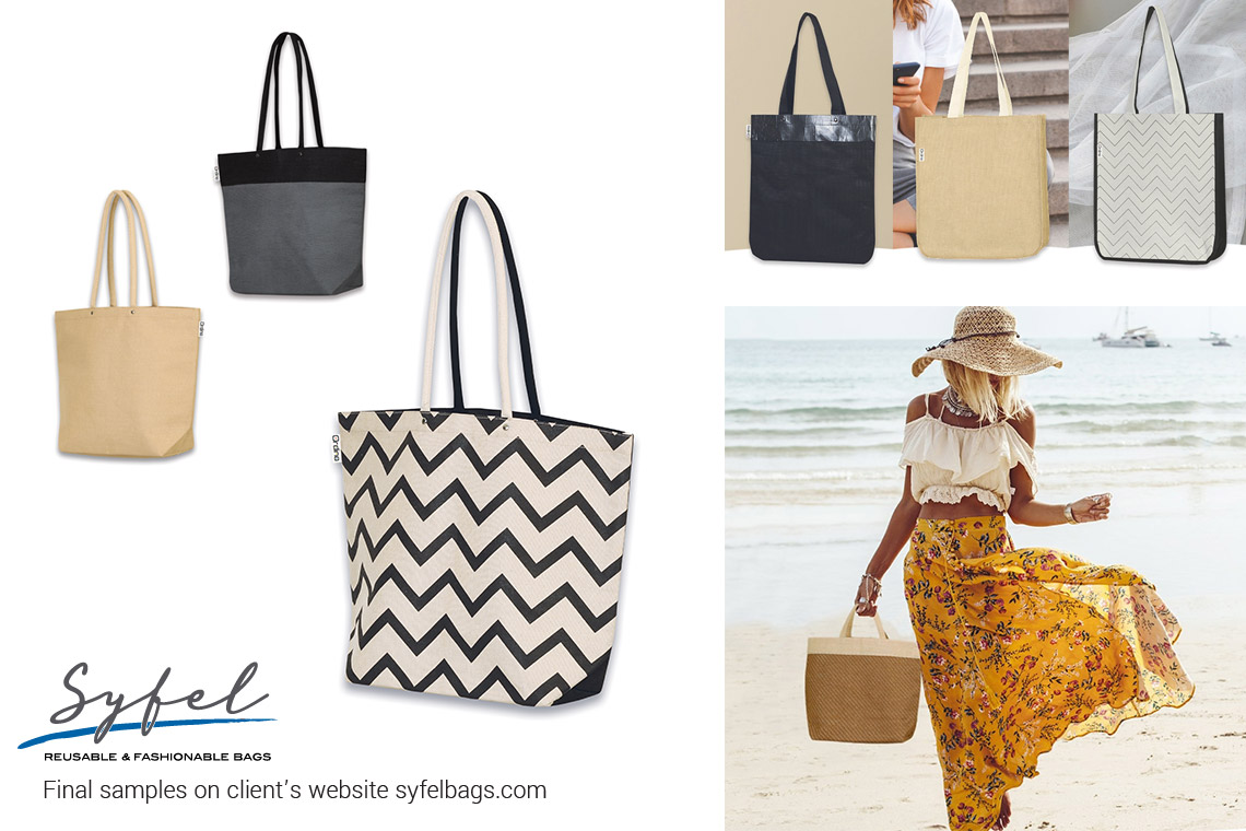
Brief: Syfel, a Canadian company manufacturing reusable fashionable bags as well as supermarket grocery bags wanted to expand their product assortment with shoppers and totes suitable for the modern, Eco-conscious EU consumer in an attempt to enter this new market.
Result: Based on my previous experience and after consulting European retail trends and visiting fairs I came up with some concepts that that were affordable, sustainably produced and suited for the European market taste.
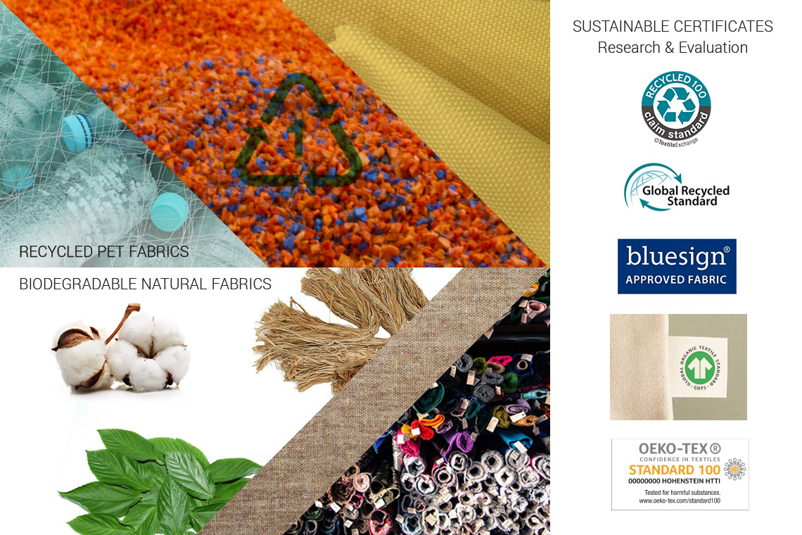
As a first step I did research and analysis on sustainable eco-fabrics and materials. Both the recycled content (recycled PET) and natural (bio-degradable) possibilities were explored and explained to the client in detail with pros and cons. Various sustainability certifications were explored.
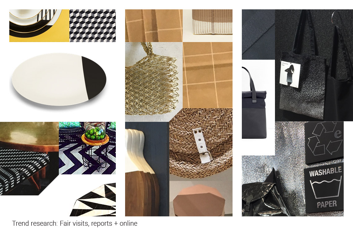
At the same time I did extensive retail and competitor research and analysis, both online, in stores and at the fairs. i refined my findings in a trend report where various concepts and colors-schemes were presented. This step is very important to identify available opportunities and ensure that new ideas are at the same time familiar but not already on the market.
After identifying many retail color and fabric trends I re-combined these with other research sources and distilled all these factors and possibilities into 3 main directions/concepts of color and style. These 3 concepts will be then applied to various products so they had to be general enough to allow for various shapes and combinations of materials yet cohesive enough to form an aesthetic family.
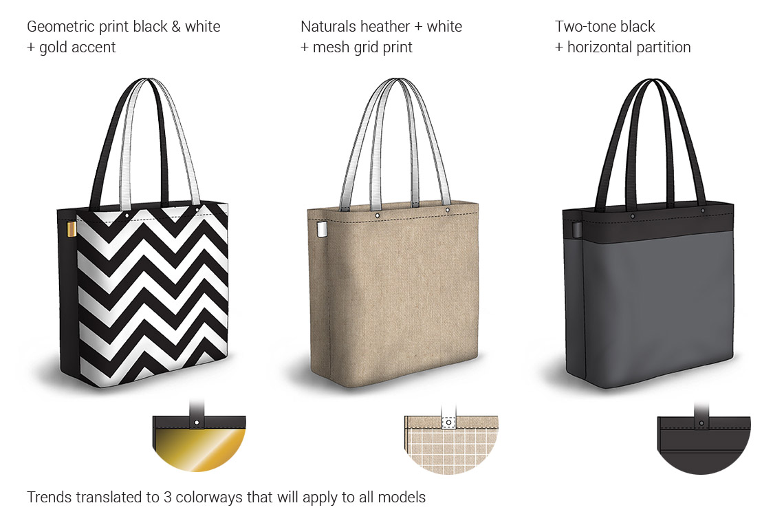
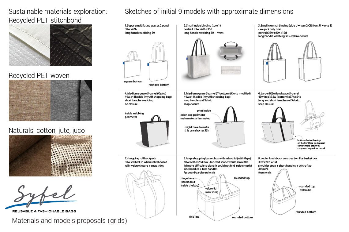
Sustainable materials, color schemes and models had to be configured together in a logical grid pattern in such a way that the client can prioritize the design sequence.
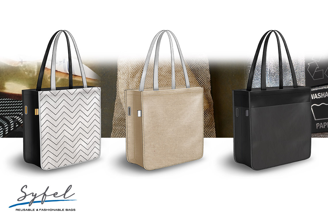
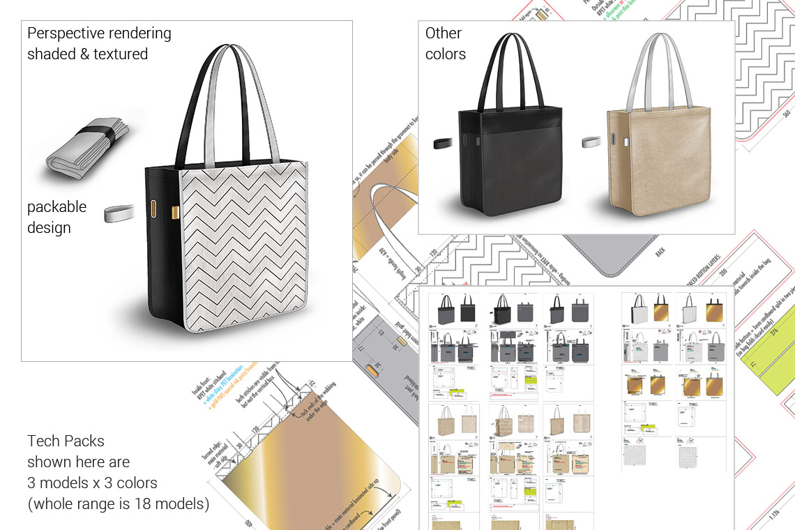
After the general dimensions and shapes of the models were chosen I made colored perspective renderings for all the models and all the chosen colors and then integrated these in detailed, dimensioned Tech Packs.
While the product design was ongoing my client also asked me to help with the name and brand design of this new European bag range. I did also for this task a research study and came up with some proposals for mood and styling. Then I designed various logos and we went trough a 3-step selection process till the final logo emerged. For this logo I made a brand guide manual with restrictions and instructions for use.
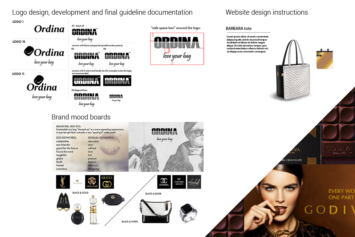
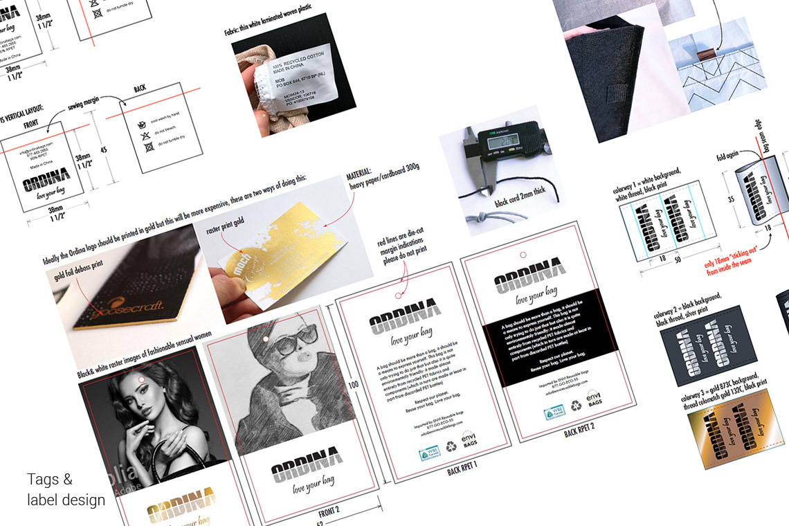
The chosen logo and brand manual was also used also as a basis for the hang-tag design and various labels. I also made proposals for text/copy for the label and marketing materials (website and catalogue).
Following the design process a normal development and revision process followed: the TechPacks were sent to Asian factories that in turn made prototypes and offered quotes. Via emails and phone calls numerous questions were asked and answered, many choices were made and various models were fine-tuned 2 or 3 times until the desired look and feel at the desired target price was achieved.
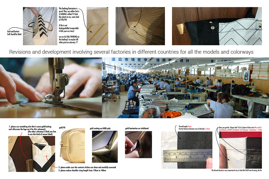
After the 3 months revisions process final samples were made and these were used for a photo-shoot. These images were then used by an agency to make a catalogue and website.
